
The Pastures at Dover | Naming & Branding
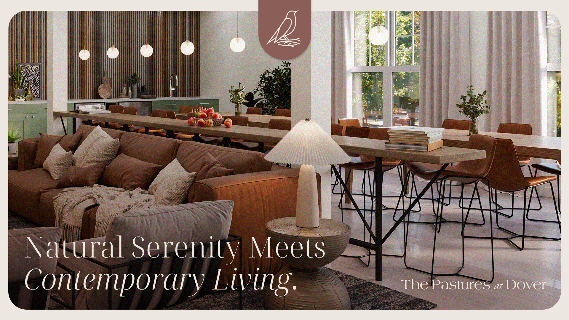
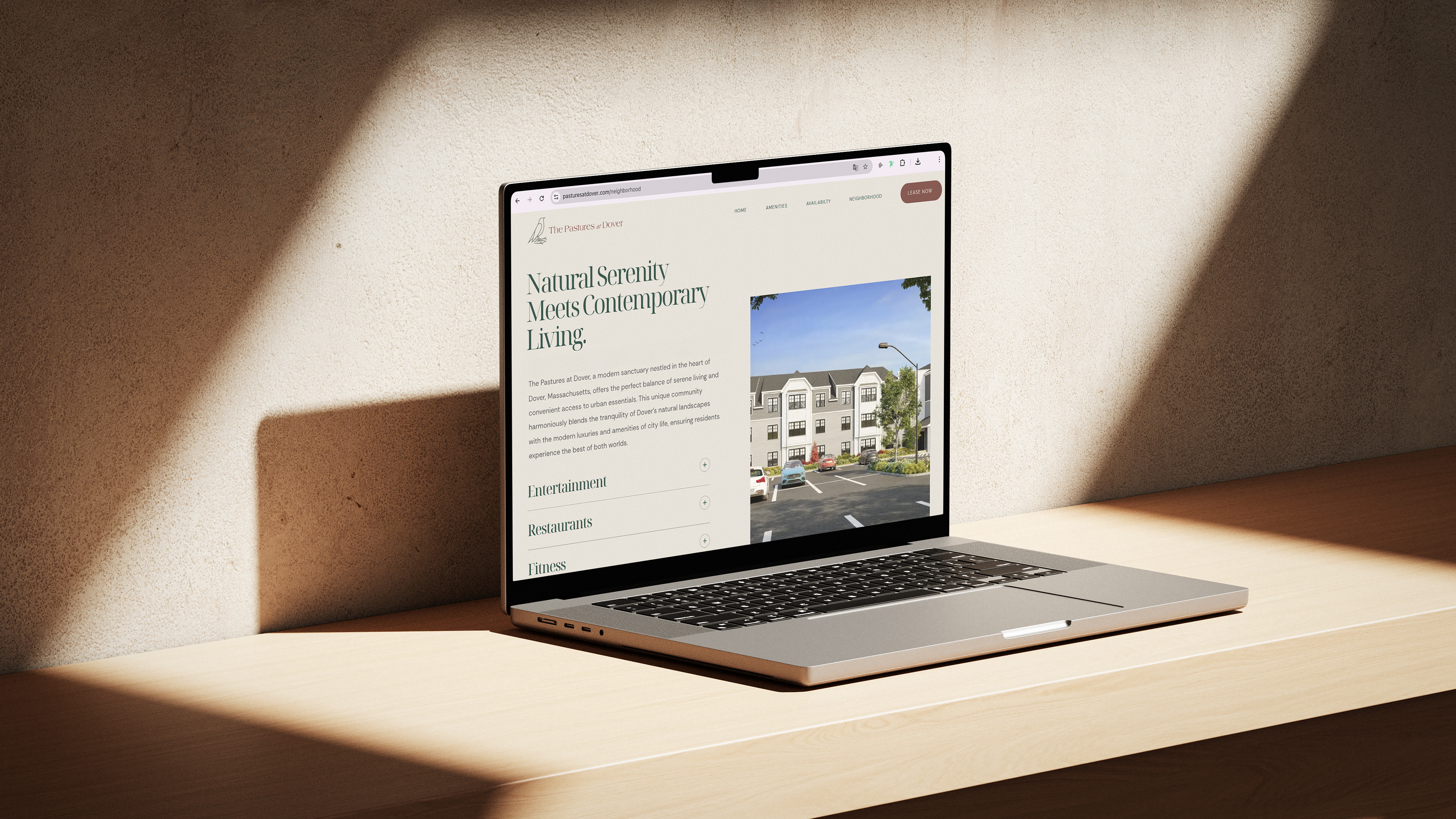
The Pastures at Dover is a refined residential development nestled in the quiet charm of Dover, Massachusetts. Surrounded by nature and steeped in a sense of exclusivity, the project seeks to offer more than just high-end living — it delivers harmony, connection, and timeless elegance.
Our visual identity is grounded in graceful simplicity, reflecting the core pillars of the brand: Harmony with Nature, Sophisticated Convenience, Community & Connection, and Luxurious Sustainability.
With a visual language that blends organic textures, purist lines, and a touch of modern softness, this identity bridges the tranquility of rural life with the refinement of contemporary design. The result is a brand that feels uplifting, welcoming, and deeply rooted in place.
Brand Pillars
Luxurious Sustainability
Luxury and sustainability intertwine seamlessly at The Pastures through conscientious design and eco-friendly high-end amenities.
Harmony with Nature
We preserve and integrate the innate beauty of Dover’s landscapes into every corner of The Pastures so residents can enjoy rich natural surroundings.
Sophisticated Convenience
Located near the city for easy access yet a peaceful retreat, The Pastures offers convenience without compromise.
Community and Connection
With shared spaces and regular events, The Pastures goes beyond just a place to live by fostering genuine bonds and relationships.
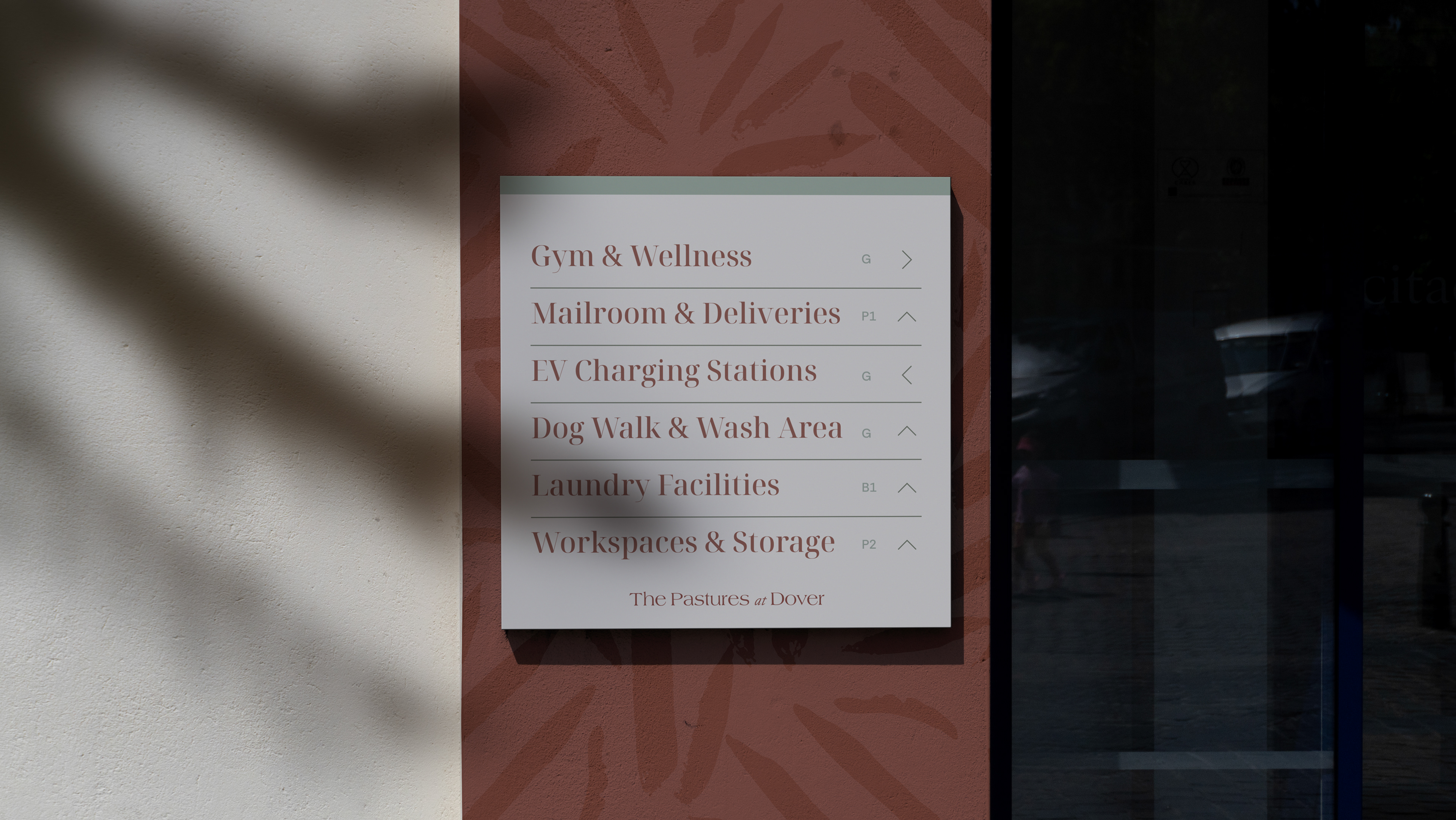
Brand Identity
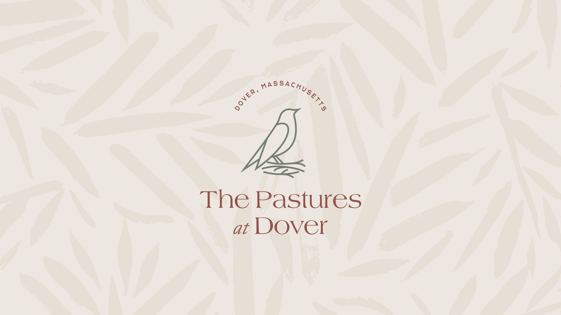
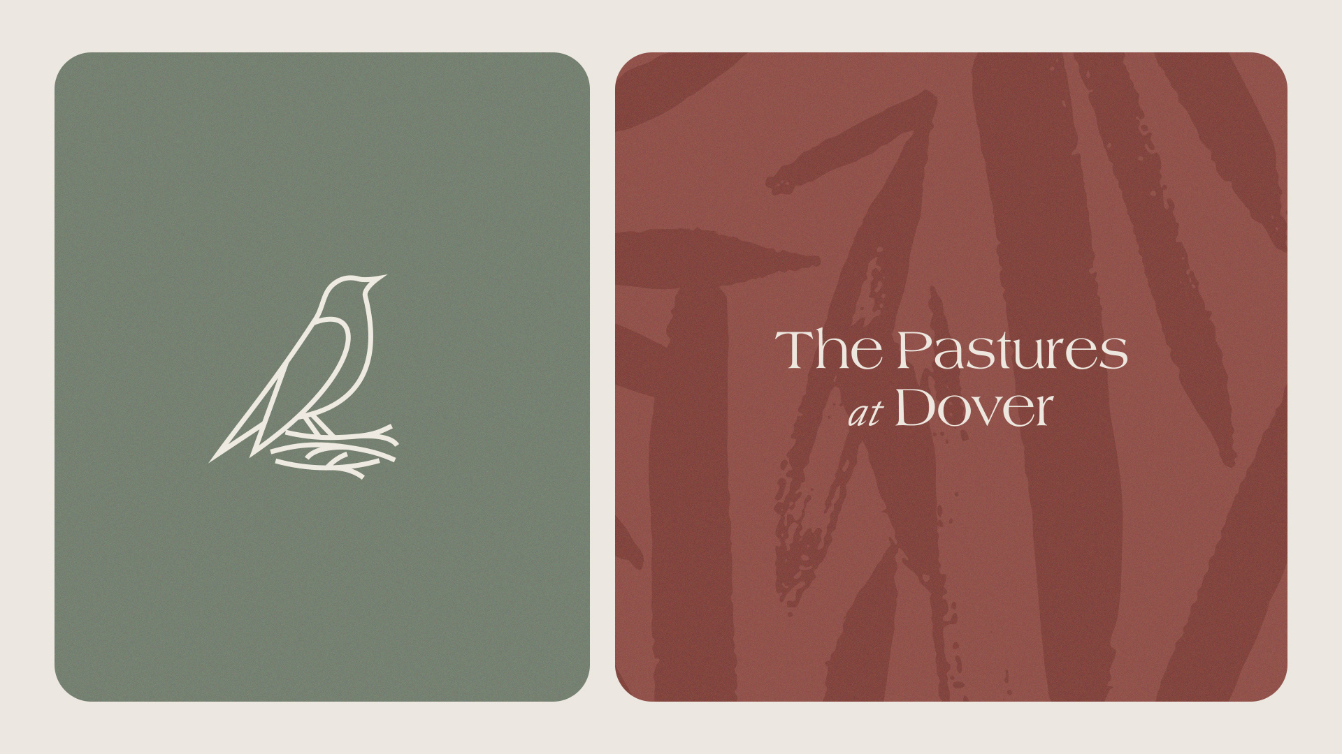
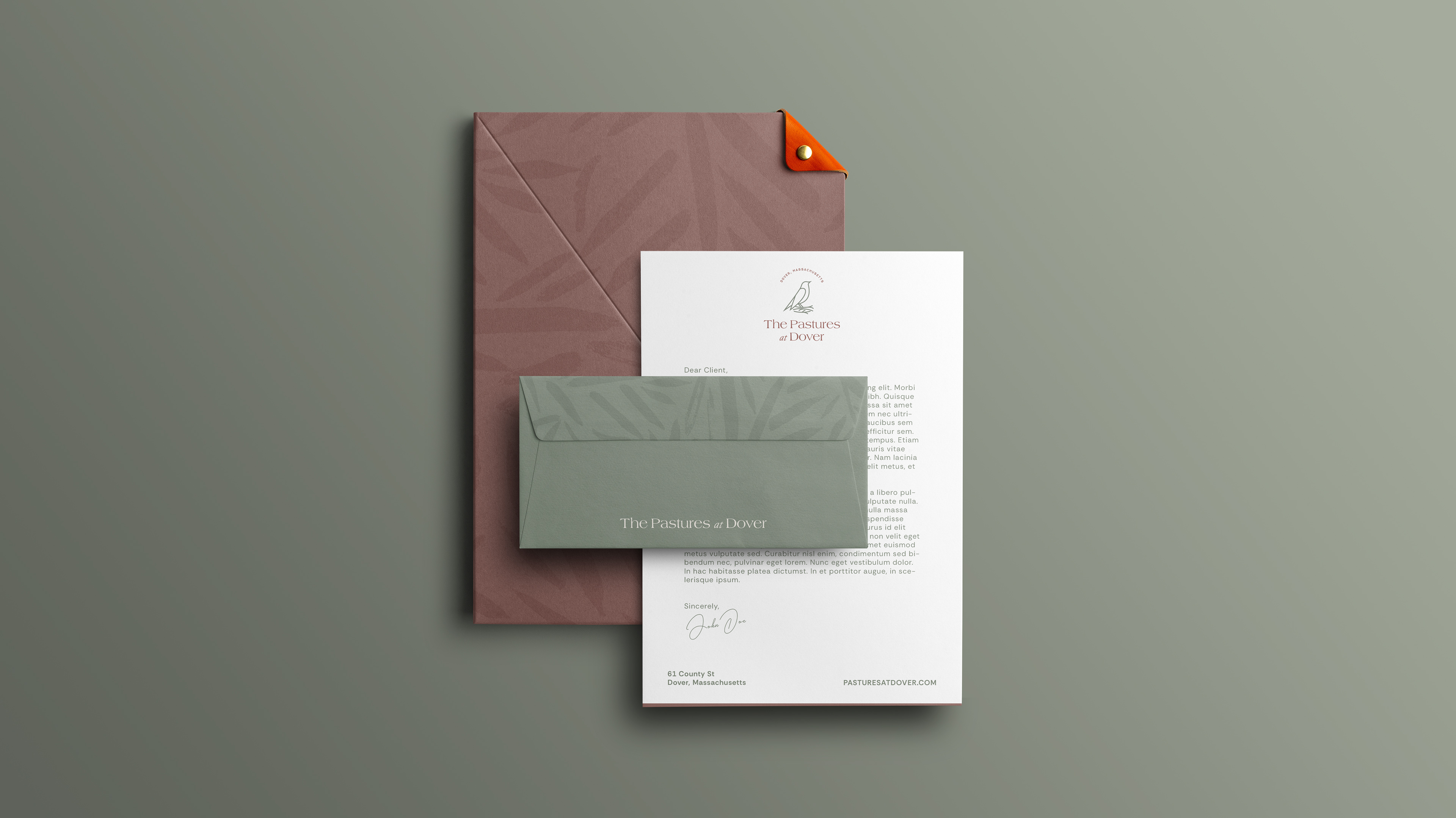
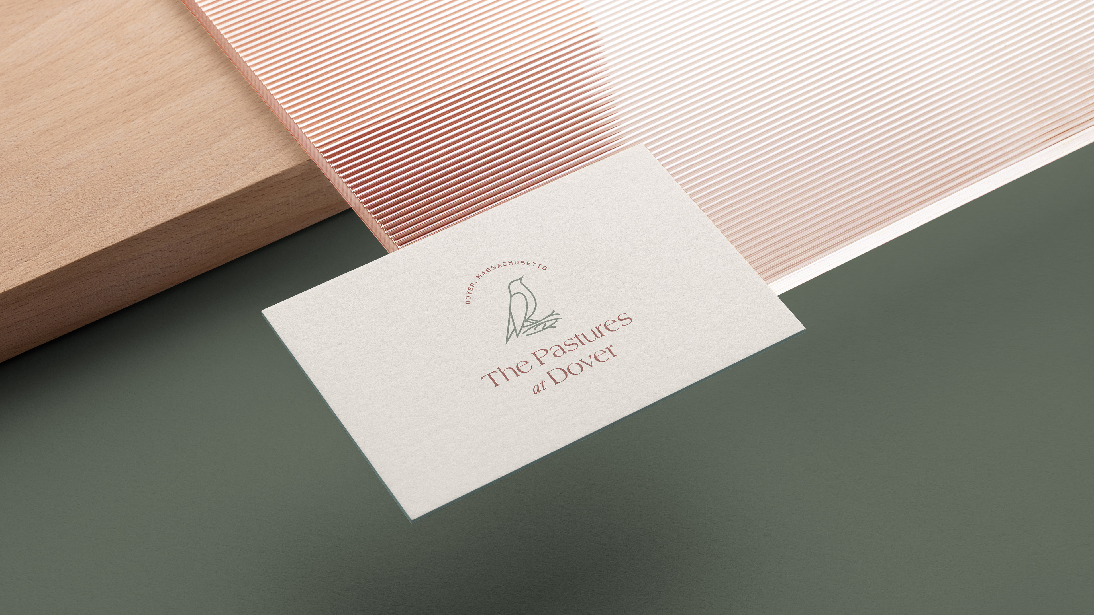
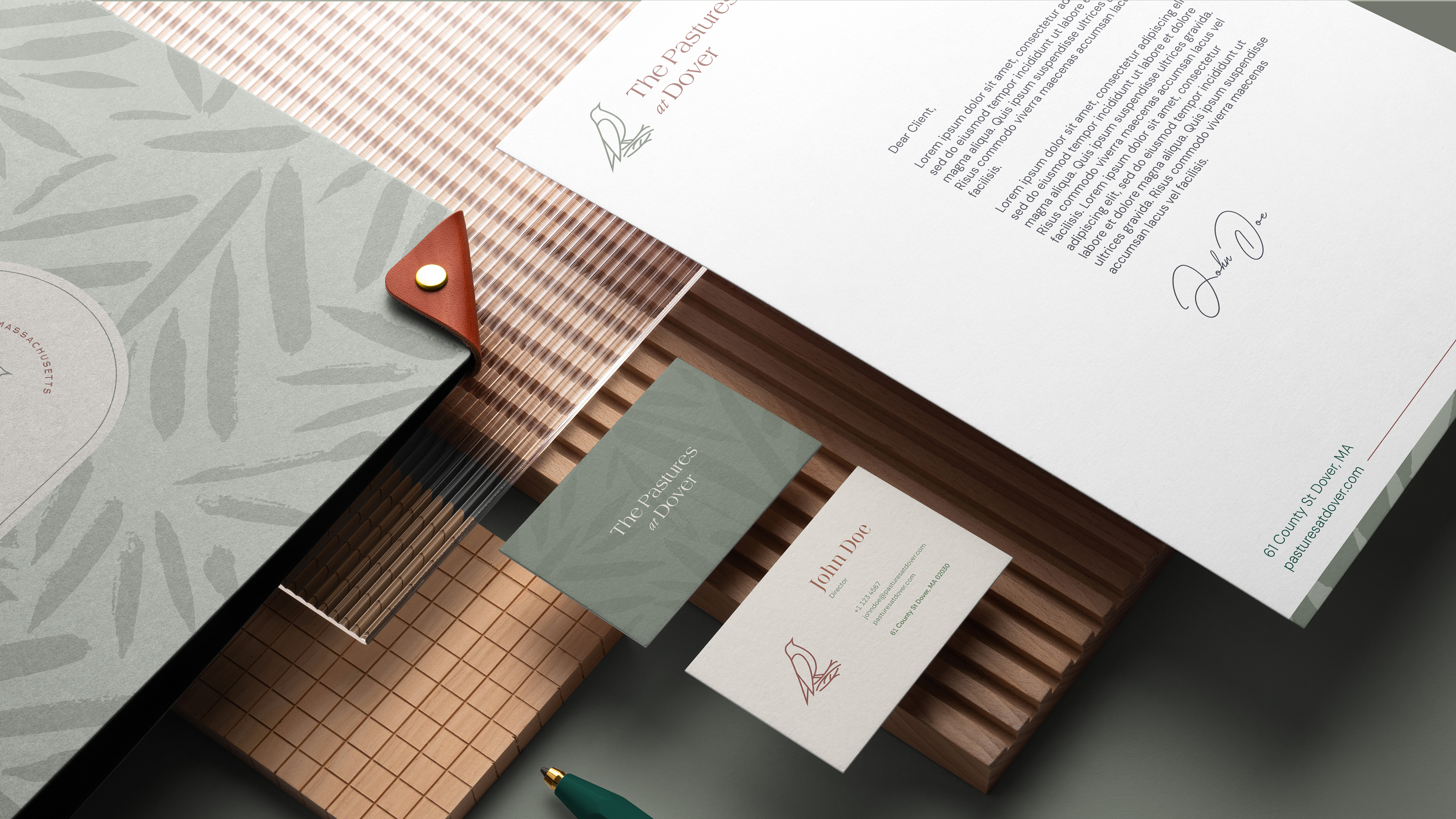
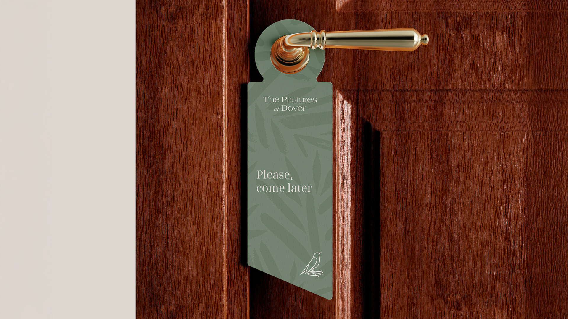
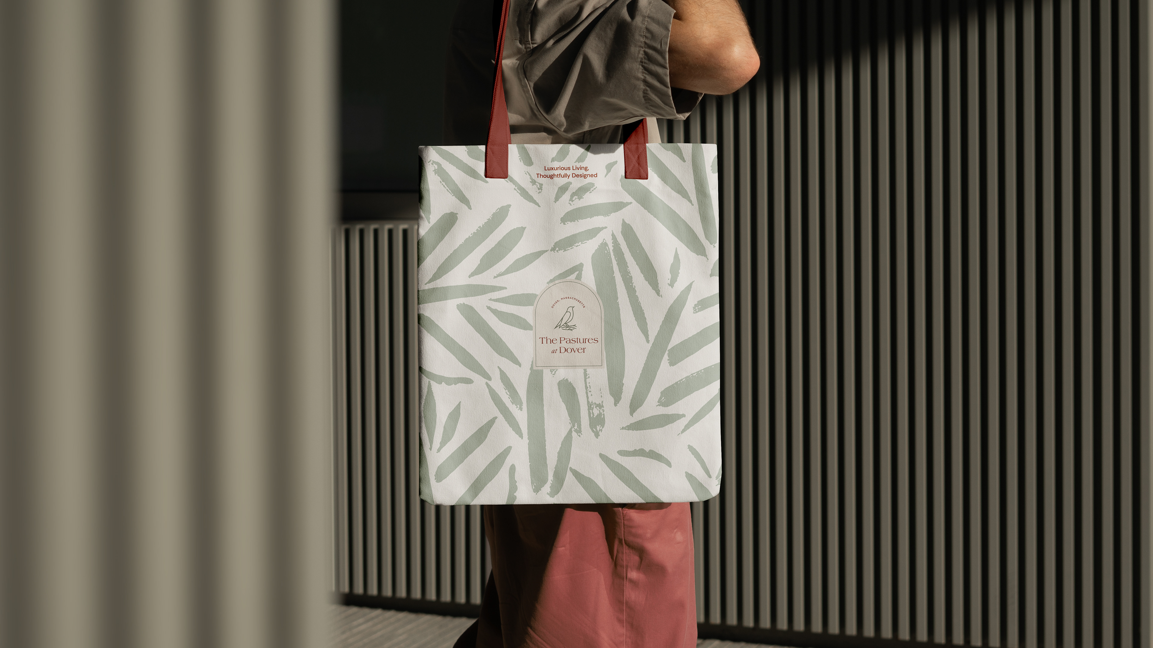
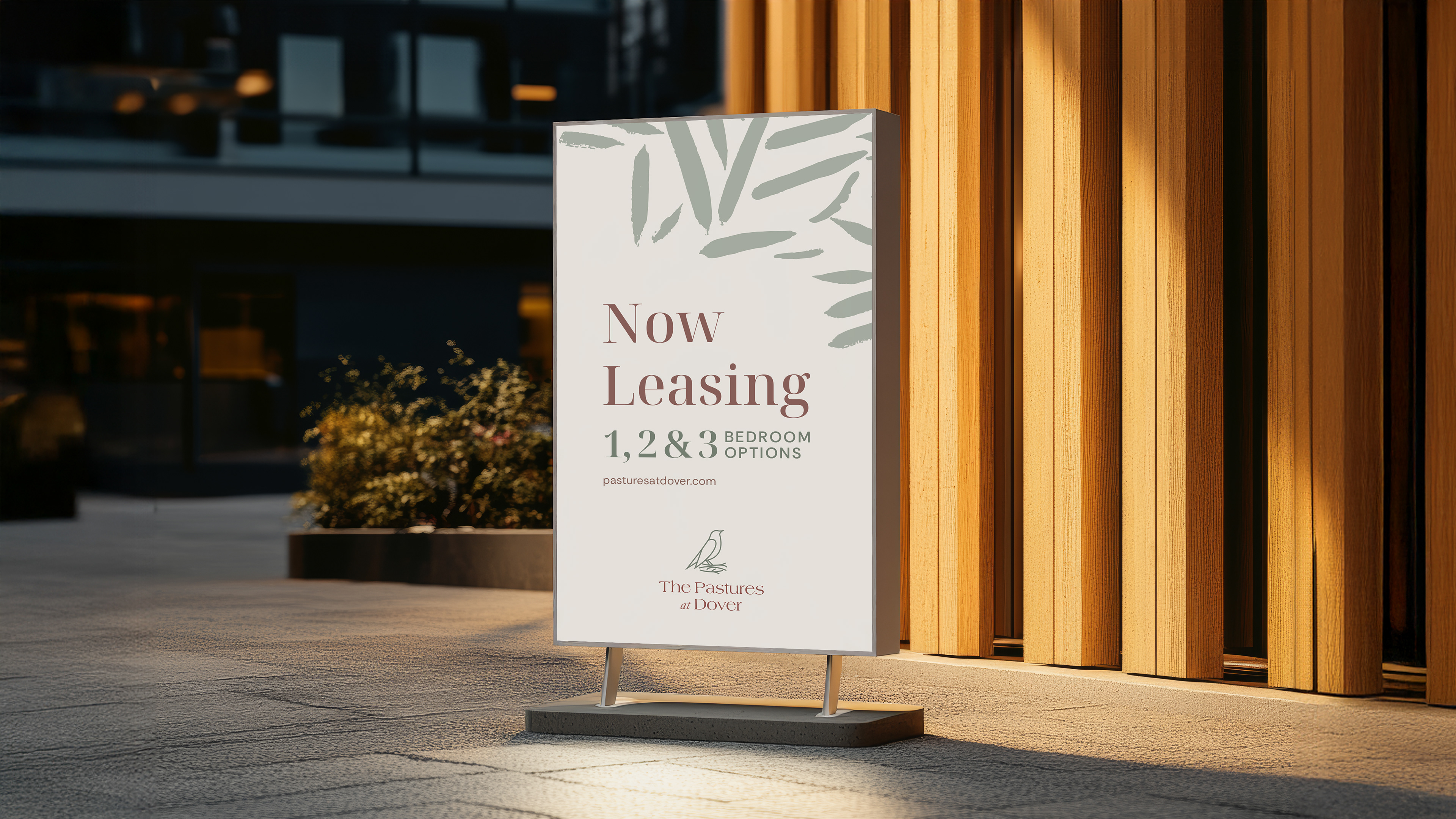
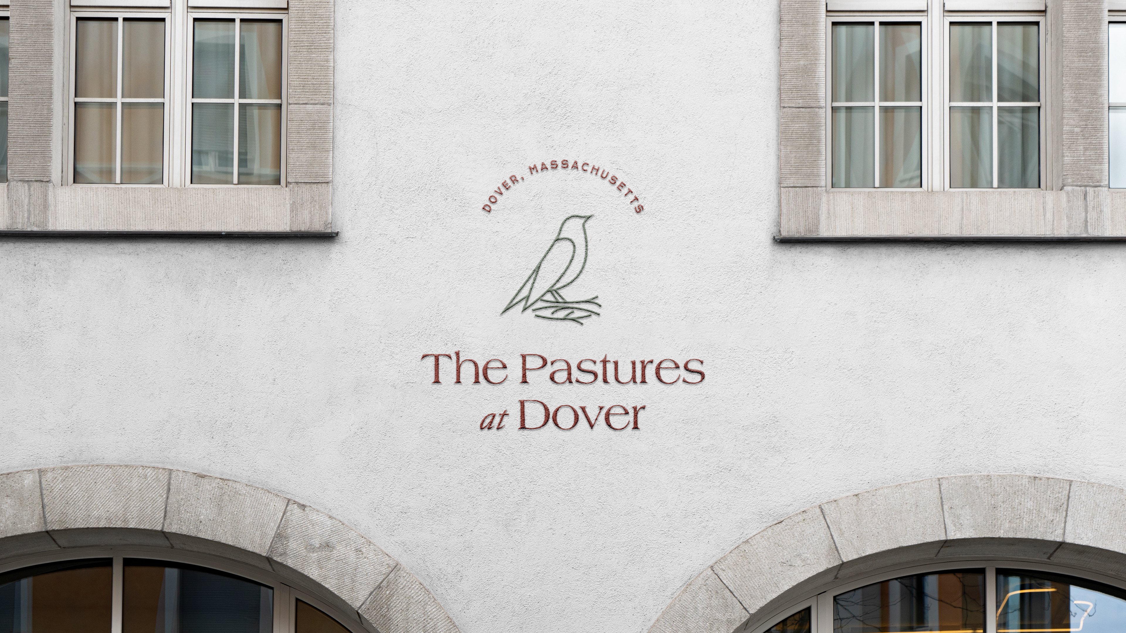
At the heart of the brand lies a symbol of a bird in its nest, a metaphor for safety, care, and rooted belonging. The nest becomes a visual expression of sanctuary, suggesting not just a residence, but a place to build, grow, and stay.
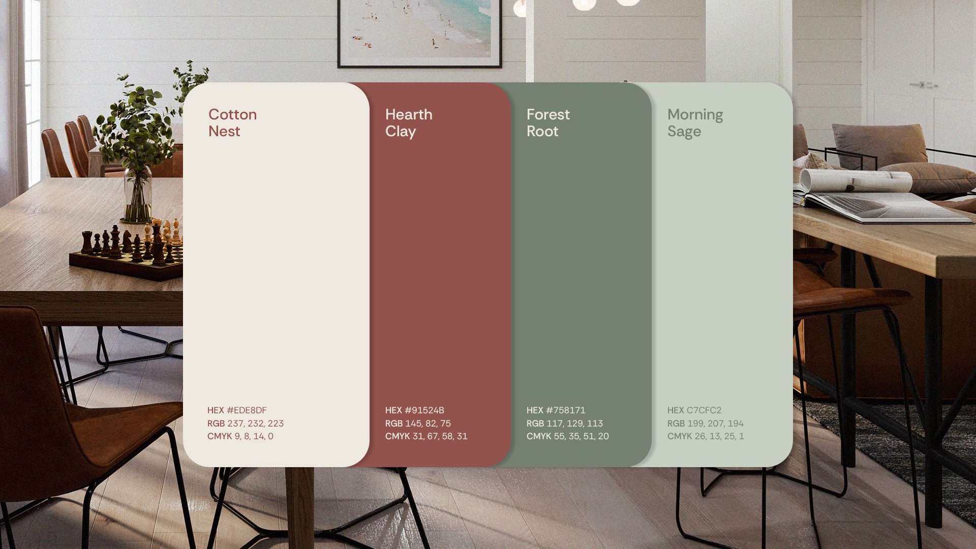
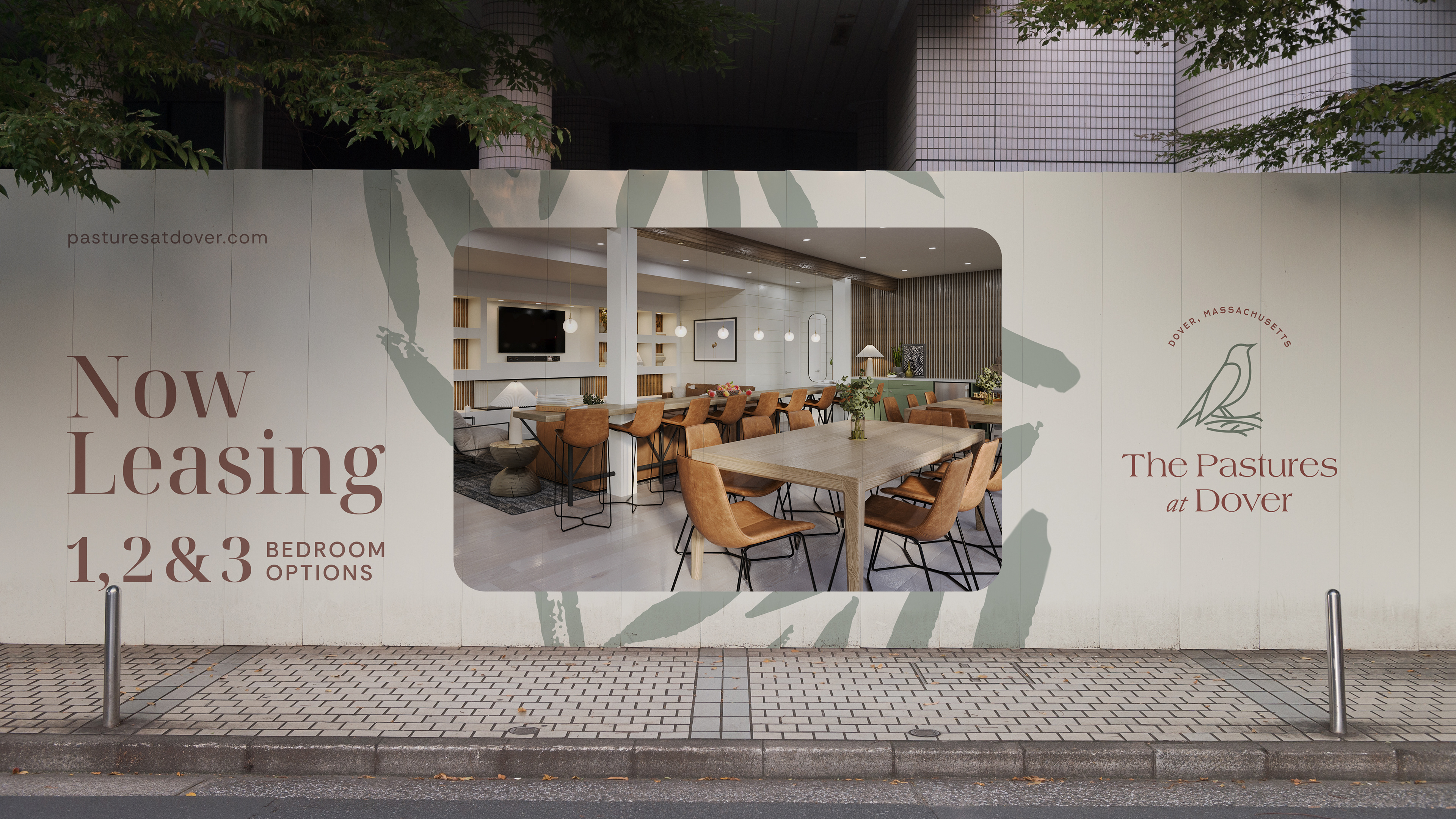
The color palette draws deeply from the natural surroundings of Dover. Warm neutrals, soft greens, muted earth tones, and gentle stone shades create a visual environment that feels both organic and timeless.
This chromatic harmony reinforces the brand’s emotional promise: to offer a lifestyle grounded in nature, tranquility, and understated elegance.
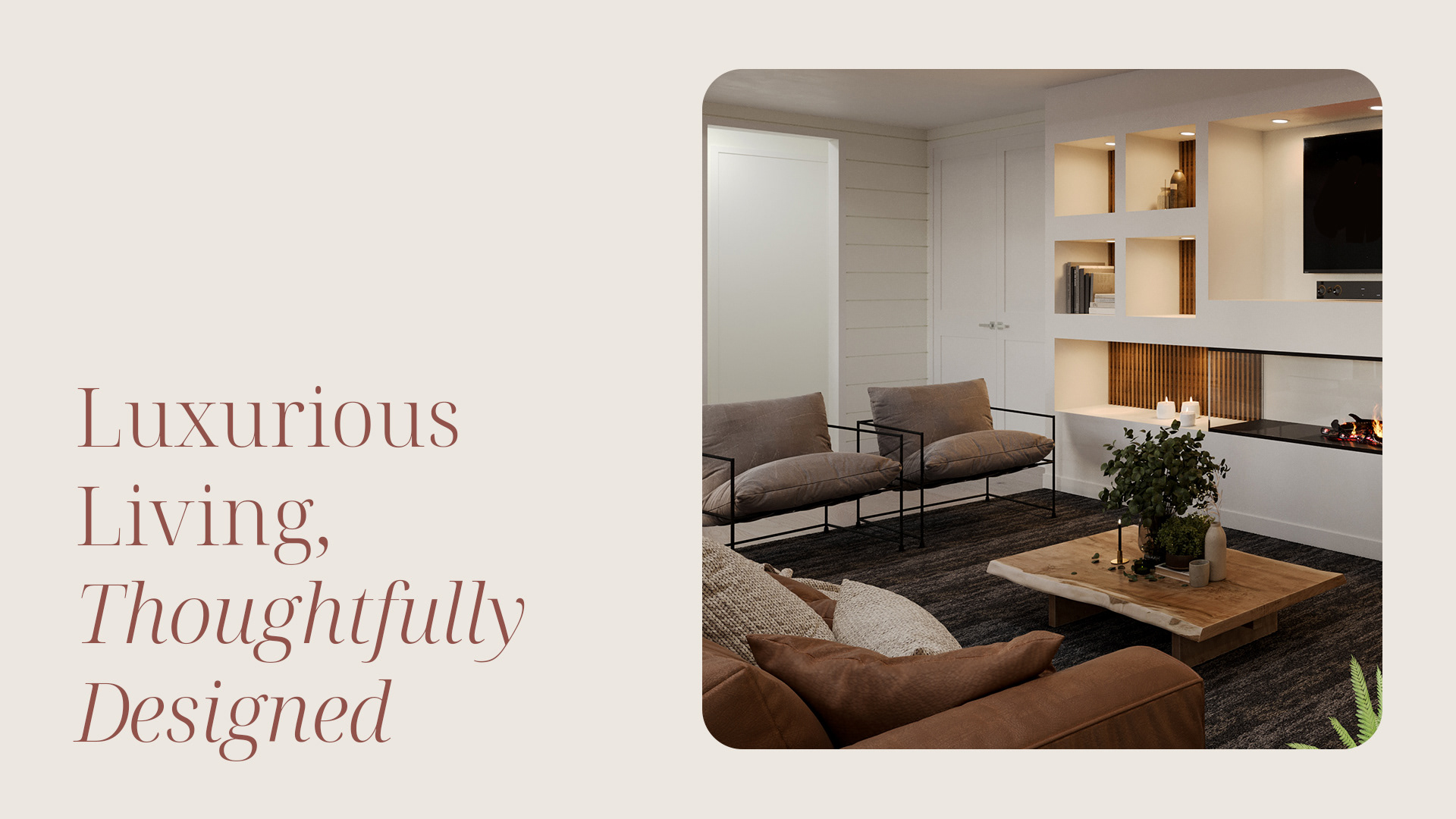
The design is intentionally minimalist, with clean and soft lines that evoke a sense of grace and purity. Its simplicity is not about absence — it’s about clarity, about stripping away excess to reveal what matters: the feeling of home.
Thank you!
Client: The Pastures at Dover
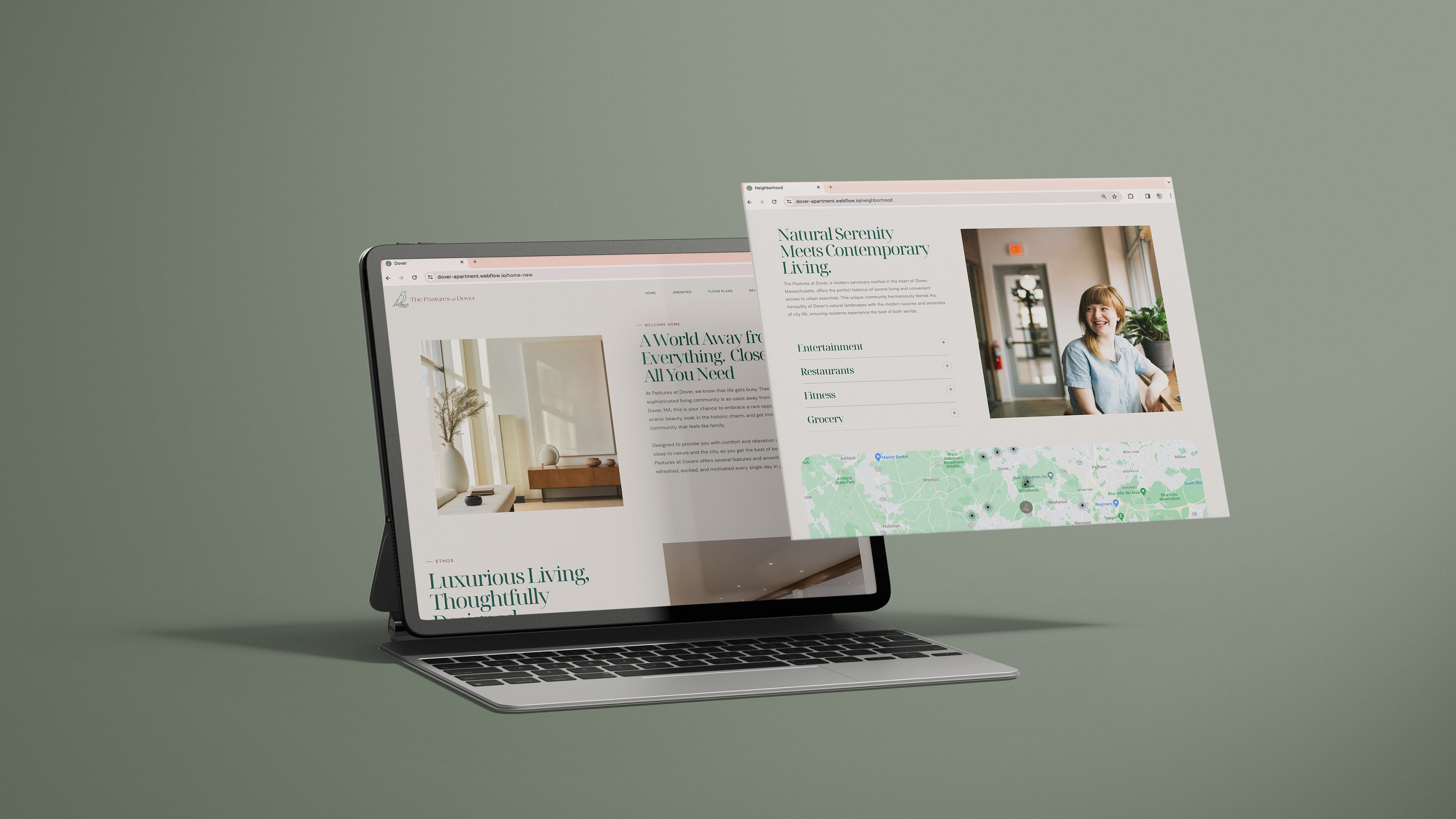
Role: Naming, Branding and Web Design.
Role: Naming, Branding and Web Design.
Creative Direction: Safia Kerr
Art Direction: Tharinne Borba and Safia Kerr
Art Direction: Tharinne Borba and Safia Kerr
Naming and Web Design: Safia Kerr
Year: 2024
Want to start a new project?
Contact us at: hello@havencollective.co
Contact us at: hello@havencollective.co